Quintiles of Socioeconomic Disadvantage of Area
Background
The Quintiles of Socioeconomic Disadvantage of Area data for the whole population, presented as Inequality graphs, are based on the ABS Index of Relative Socio-economic Disadvantage 2021. The Inequality graphs for the Aboriginal and Torres Strait Islander population were produced as described below but using the Indigenous Relative Socioeconomic Outcomes index (IRSEO), an Indigenous-specific index derived by the Centre for Aboriginal Economic Policy Research (CAEPR), now the Centre for Indigenous Policy Research (CIPR), from the 2021 Census of Population and Housing.
Calculation of quintiles
To calculate rates by socioeconomic status, Population Health Areas (PHAs1) were ranked based on the Index of Relative Socio-economic Disadvantage score from the 2021 Census. The listing of PHAs was then divided into five groups with each group comprised of approximately 20% of the population in Australia. The data for each indicator in this atlas were then allocated (at the PHA level) to the appropriate group and the rate for that indicator calculated for each of the five groups; the groups are referred to as quintiles of socioeconomic disadvantage of area, reflecting the area-based measure on which they are based. This exercise was repeated for PHAs in each State and Territory, each Greater Capital City and each Rest of State/Territory area.
Measures
There are two measures discussed with respect to the quintiles; one is the variation across the quintiles (referred to as the social gradient), the other is the difference in rates between the most and the least disadvantaged areas (measured by the rate ratio).
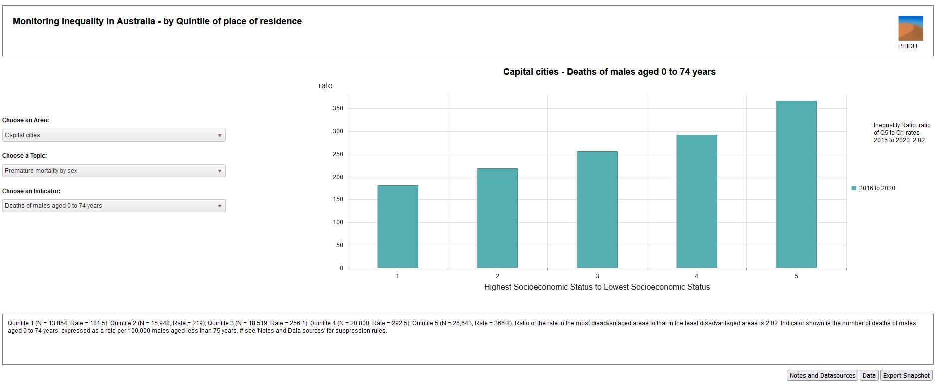
To describe the magnitude of variation between the most disadvantaged (Quintile 5) and least disadvantaged (Quintile 1) quintile, a rate ratio is calculated for each indicator. A rate ratio of 1 indicates that the rate in the least and most disadvantaged quintiles is the same. A rate ratio greater than 1 shows there is a higher rate in the most disadvantaged quintile, e.g., a rate ratio of 2 would indicate there is double the activity in the most disadvantaged compared to the least disadvantaged quintile. Rate ratios that are greater than or less than 1 are indicative that there may be some inequality in access to services across population groups, or in early death when looked at by level of disadvantage. See Figure 1, below, for an example of a rate ratio.
It is also important, and informative, to note that variations typically occur across all the quintiles, and that in many cases, there is a social gradient, a variation in the data that shows percentages or rates indicating poorer outcomes across the socioeconomic spectrum. This social gradient is often described as being ‘stepwise’, with, for example, a higher premature mortality rate in each subsequent quintile, as in Figure 1, below.
Figure 1: Deaths of males age 0 to 74 years, by quintile of socioeconomic disadvantage, Australia, 2016 to 2020

Source: https://phidu.torrens.edu.au/current/graphs/sha-aust/quintiles/aust/premature-mortality-sex.html
Quintiles of Socioeconomic Disadvantage of Area over time
A separate module presents data in this way for indicators which are available over time. The IRSD scores for each Census were used to produce the quintiles for the Census year and the two years before and the two years after that Census year. So, the 2001 IRSD score was used to produce quintiles for 1999, 2000, 2001, 2002 and 2003. The exceptions were the 1986 IRSD, which was applied to the years 1987 and 1988, and the 2016 IRSD, which was applied to the years 2014 to 2017. A limitation of this approach using the IRSD, is that the Australian Bureau of Statistics, who produce the IRSD, undertake a principal components analysis following each Census, with some change in variables in the analysis. However, we are not aware of a more robust process for making this comparison.
To access the Quintiles of Socioeconomic Disadvantage of Area over time data - see Time Series
Quintiles of Socioeconomic Disadvantage of Area within Primary Health Networks
The Quintiles of Socioeconomic Disadvantage of Area data for the whole population, presented as Inequality graphs, are based on the ABS Index of Relative Socio-economic Disadvantage.
To calculate rates by socioeconomic status within Primary Health Networks (PHNs), Statistical Areas Level 2 (SA2s) or Population Health Areas (PHAs1) were ranked based on the Index of Relative Socio-economic Disadvantage score from the 2021 Census, within their PHN. The listing was then divided into five groups with each group comprised of approximately 20% of the PHN's population. The data for each indicator in this atlas were then allocated (at the SA2 or PHA level) to the appropriate group and the rate for that indicator calculated for each of the five groups; the groups are referred to as quintiles of socioeconomic disadvantage, reflecting the measure on which they are based.
In addition to showing the variation between the quintiles for each indicator in a chart, a rate ratio is given to describe the magnitude of variation between the most disadvantaged (Quintile 5) and least disadvantaged (Quintile 1) quintile for each indicator. A rate ratio of 1 indicates that the rate in the least and most disadvantaged quintiles is the same. A rate ratio greater than 1 shows there is a higher rate in the most disadvantaged quintile, e.g., a rate ratio of 2 would indicate there is double the activity in the most disadvantaged compared to the least disadvantaged quintile. Rate ratios that are greater than or less than 1 are indicative that there may be some inequality in access to services across population groups, or in early death when looked at by level of disadvantage. However, it is also important, and informative, to note that variations occur across all the quintiles: in many cases there is a social gradient, a variation in the data that runs from top to bottom of the socioeconomic spectrum.
1Prior to 2011, quintiles of socioeconomic disadvantage of area were based on Statistical Local Areas.


